Love or Loathe: Unrealized Potential
 The back view of this heel is gorgeous. I love the ankle strap. I love the shape of the heel. I LOVE the tortoiseshell. If Seychelles' "Music To My Ears" pump continued with such promise, I would buy them right now.
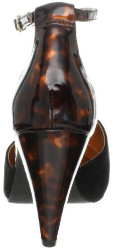
The front, however, fails to live up to the promise of the back. What a giant thud! It's like a cross between a mule and a hoof. Adding color might make the design uglier, and that's not something I often say.
Am I being too harsh? Are these perfectly lovely or do you agree that they look a little clunky?


Comments